
M. Nishioka, Sci Rep J. 2:192 (2023)
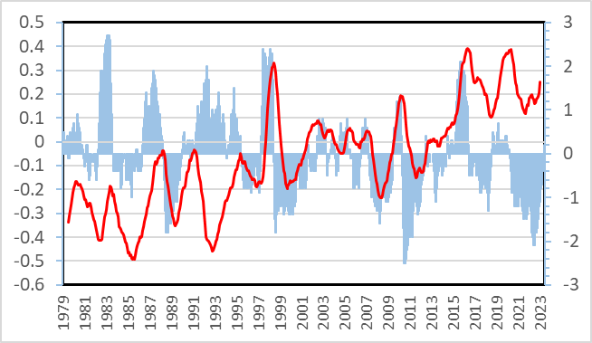
Figure 1 Correlation between temperature and ENSO index during 1979-2022. Temperature (°C, red line): 13-month average of lower troposphere anomaly values by UAH with scales on the left. ENSO index (blue vertical lines): two-month average by NOAA with scales on the right.
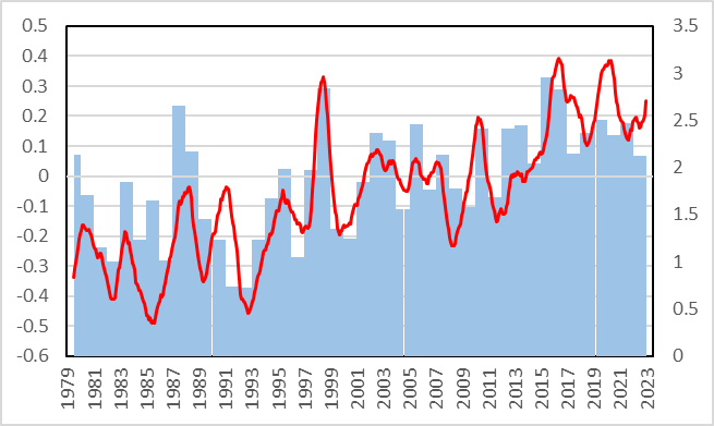
Figure 2 Correlation between temperature and CO2 changes during 1979-2022. Temperature (°C, red line): 13-month average of lower troposphere anomaly values by UAH with scales on the left. CO2 (ppm/year, blue vertical lines): difference from the previous year in annual averages by NOAA with scales on the right.
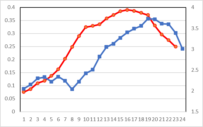
Figure 3 Change in temperatures and CO2 concentrations during El Nino in 2015-2016 (horizontal line: months starting January 2015), (red: UAH lower troposphere 13-month average temperature (℃) with left side scale, blue: monthly CO2 growth rate (ppm/year) reported by NOAA with right side scale)
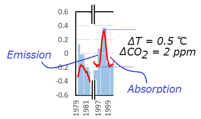
Figure 4 Changes in global temperatures and CO2 concentration growth rate from Figure 2 during El Niño in 1997-99
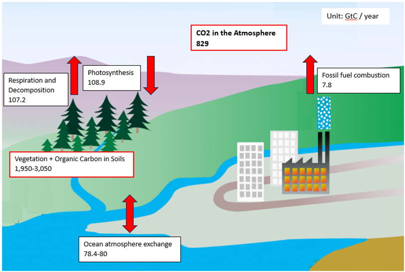
Figure 5 Simplified carbon cycles and carbon equivalent estimates (unit: GtC) obtained from the IPCC report
![]()
Figure 6 Derived processes for El Niño, global temperature, plant respiration (or decomposition), and subsequent global CO2 emissions