M. Nishioka Curr Res Env Sci Eco Letters 1(1), 01-09, 2024
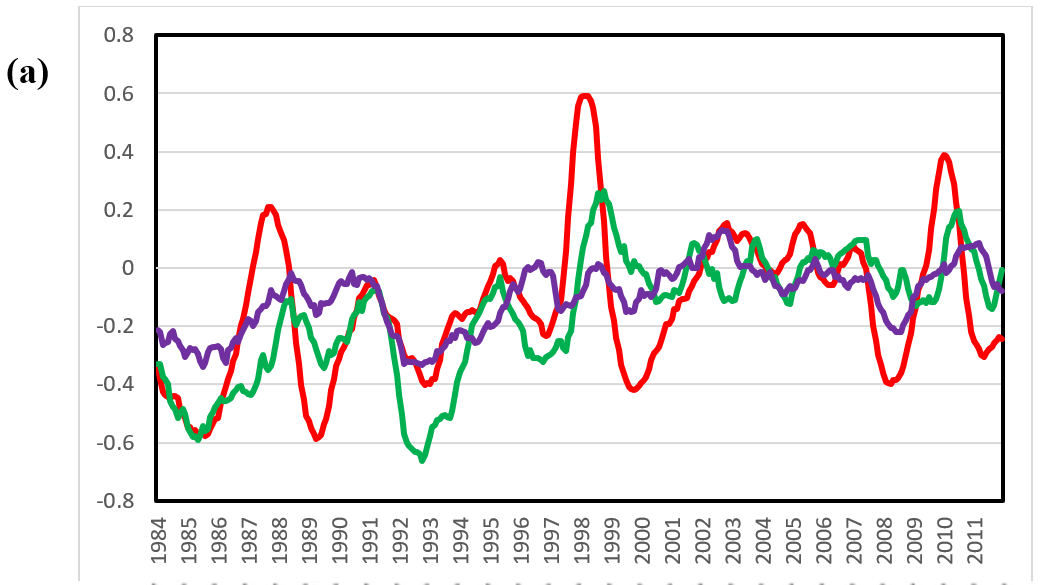
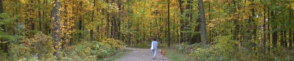
Figure 1. (a) Temperature change (℃) in the tropics (20 S-20 N, red), north latitude (20 N-90 N, green), and south latitude (20 S-90 S, purple) between 1984 and 2011 and (b) the change rate of CO2 concentration (ppm/year) across latitudes between 1984 and 2011 [7]
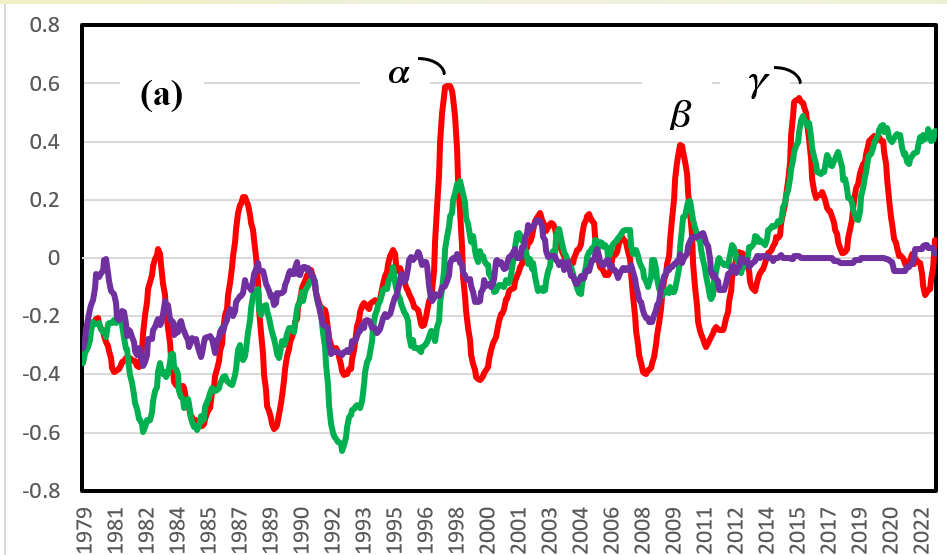
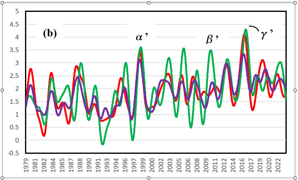
Figure 2. (a) Temperature change (℃) between 1979 and 2022 in the tropics (20 S-20 N, red), north latitude (20 N-90 N, green), and south latitude (20 S-90 S, purple); (b) the change rate of CO2 concentration (ppm/year) with latitude between 1979 and 2022 at sine latitudes (-0.75≒50 S: purple, 0: red, and 0.75≒50 N: green)
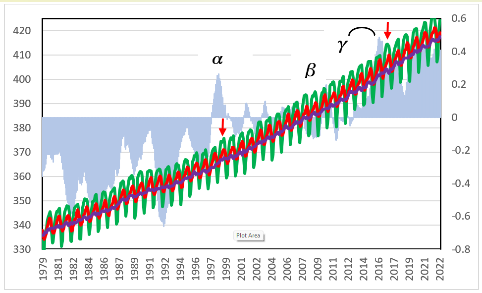
Figure 3. CO2 concentrations (ppm, left scale) between 1979 and 2022 at Barrow, AK (green); at Mauna Loa, HI (red); and at Tutuila, American Samoa (purple); and anomalies of temperature change (℃, cyan, right scale) between 1979 and 2022 at north latitude (20 N-90 N).
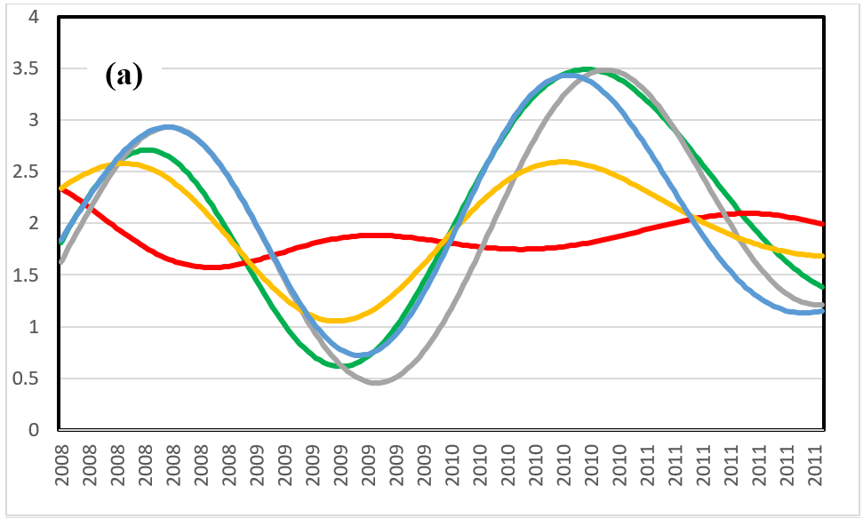
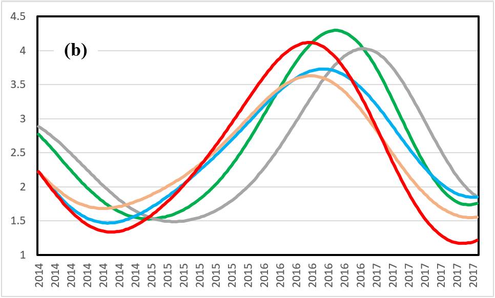
Figure 4. (a) The change rate of CO2 concentration (ppm/year) at sine latitudes (0: red, 0.25: yellow, 0.50: blue, 0.75: green, 1.0: gray) between 2008 and 2011 (see point β in Figure 2(a) and point β’ in Figure 2(b)); (b) the change rate of CO2 concentration (ppm/year) at sine latitudes (0: red, 0.25: yellow, 0.50: blue, 0.75: green, 1.0: gray) between 2014 and 2017 (see point γ in Figure 2(a) and point γ’ in Figure 2(b)).
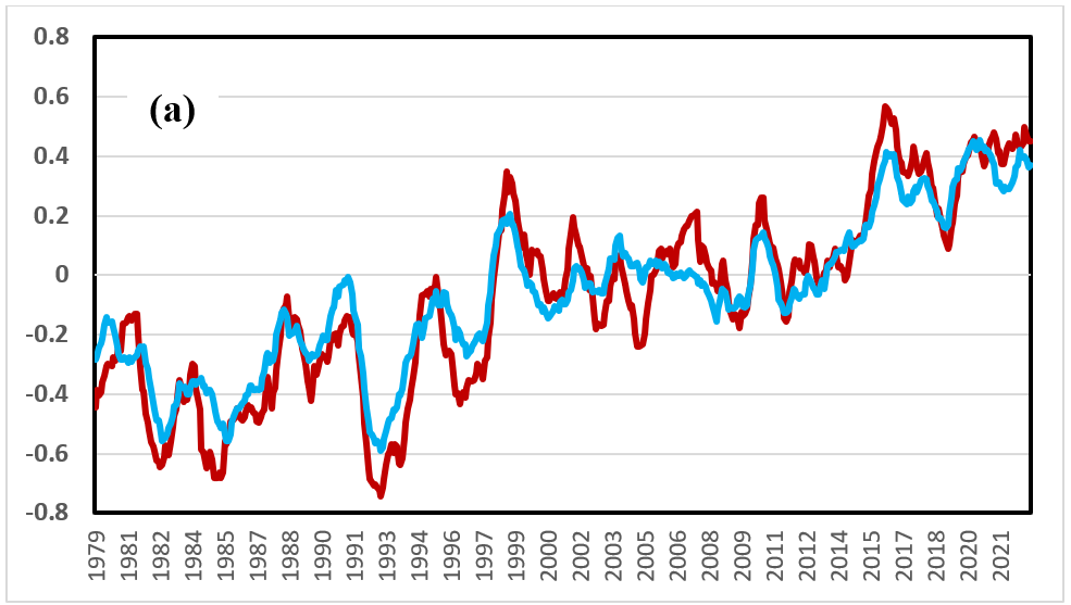
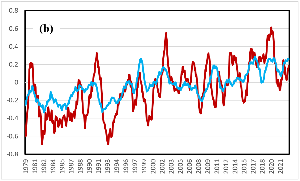
Figure 5. Temperature changes (℃) on land (brown) and in the ocean (blue) between 1979 and 2022 at (a) southern latitude (20 S-90 S) and (b) northern latitude (20 N-90 N).
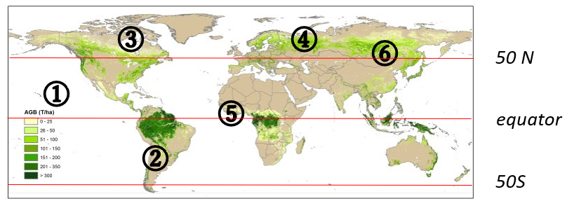
Figure 6. Changes in temperature and CO2 concentration in the atmosphere at different latitudes, and forest biomass distribution [8]. See Table 1 for the descriptions numbered.
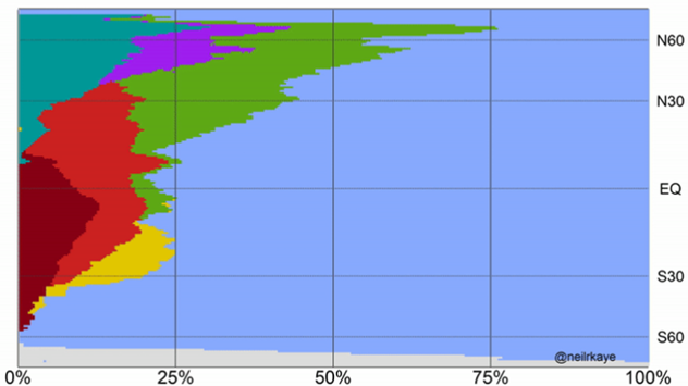
Figure 7. Area ratio between land and sea at different latitudes (the blue portion denotes sea, and other colors denote land). (See [13] for details.)
Table 1. Summary of the results obtained in this study. The numbers correspond to those in Figure 6.